
What is the purpose of a Logo?
April 24th, 2023
What comes to your mind when you think of your fav[...]
As the holiday season is not far away to amaze customers with massive deals and discount offers, it becomes extremely important for online stores to fasten their seatbelts.
E-commerce stores with a fantastic user-experience always have an advantage over those that lack this ability. Because, every little aspect counts when we talk about the conversion rate optimization, and if a user is having difficulty in finding the intended products, he will surely look for better options.
In all such circumstances, there is one super-essential factor that often gets overlooked while we are working out a UX strategy. And, it is the “search result” that takes your customer to the right products.
Search is more like a salesperson that communicates with your prospect and helps him find the products he is looking for, and I believe that it defines the significance of having a perfect search tool on your website.
Don’t worry. If you have not been giving priority to this great UX tool, you now know the difference it can make. Therefore, this blog is going to take you to the ride on improving user-experience with on-site search results.
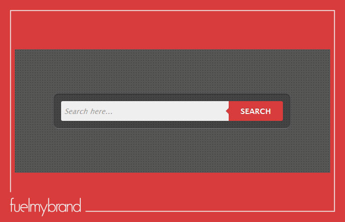
We all know what a search box holds for a prospect, right? But, if it is not easily recognizable or lost somewhere in the design, the user will most probably leave your site, because he already knows that he has got a lot of options.
So, it is better to use the search box in the upper-right, upper-left or upper-center of your layout. In this way, your visitors will have a prominent solution to get the answers to all their queries.
A good online buying experience makes things easier for customers. In this case, keeping the original text of your users ‘query can offer one. The reason is quite simple: if users don’t find the intended products, they will remodel their query. But, in this situation, removing what they have typed will distract them, which will eventually lessen their interest to search more.
Therefore, to make things easier, leaving the initial search term in the box will turn out to be a good move.
This is one big mistake that majority of web designers never stop making.
Sometimes, the query gets a little longer and only a portion of it is visible at a time. This is simply a case of bad usability since users are clearly unable to read and make changes to whatever they have typed.
It is because of such issues you should make sure that the length of the search box is adjusted in accordance with the standard input of a user.
Adding useful autosuggestions can promise a remarkable user experience. This little yet effective function guides a user and assists him in making right decisions. But, from a technical perspective, autosuggestions can offer a poor UX too, if the predictive text and suggestions are not working properly. This is what you need to take care of for speeding up the search process.
April 24th, 2023

October 30th, 2019

October 24th, 2019

October 15th, 2019

October 9th, 2019