What is the purpose of a Logo?
April 24th, 2023
Typography is the heart and soul of logo design. If you take a look at big brand names and some of the famous company logos which we frequently see then you will realize that majority of them are simple type forms which are professionally and creatively worked together. This is the power of a strong and simple type design.
Today we will provide you a sneak peak into some of the different typesetting styles and typography arrangements which can transform a company logo into a well defined corporate identity.
Typography Emblem:
Emblem style typography consists of graphic which is made up of initials or text from the company name. For example the famous “Toyota Emblem”. Below we have suggested a logo design which was completed for a coaching company which help transform results and people into top notch performers in their respective field of work. They wanted to work with “U” to represent its potential and how self believe can transform “YOUR” ordinary performance into extraordinary one. The name of the company and tag line are also suggested with the emblem design to show the true potential of the logo.
"U" Typographic Logo Design
Custom Font Design:
The next topic is about custom tailored font design. This example will demonstrate how simple text can be re-written through typography which can enhance the image of the product itself. The PhoXpress logo design was completed for a noodle shop. The name itself is written in custom designed typeset which forms the shape of noodle to highlight the business while the title in the font ( Italicized ) signify the express delivery services which they provide. So in short the whole name is visually represented through the fonts without any additional graphic.
phoxpress noodles logo design
Type as a Branding Icon::
Arranging fonts or initials in such a way that the symbol itself resembles a graphic requires good technical skills and visualization practice. Our third example is a logo for a gaming company who wanted to use a gun in their logo. As the name was short so we set out to work on their initials and transformed them into the “Pistol Shaped Logo Design”.
(RYW) Rise Your Weapons Logo Design
Our skilled logo designers have completed several projects in which the brand identity is a collective set of type which are masterfully worked together to give your corporate logo a unique yet standalone look. Some additional typography ideas are shown below for your consideration which includes signature styled typography as well.
Richard McIntyre Photography Logo Design
Here’s one more example of blending letter forms with Numeric:
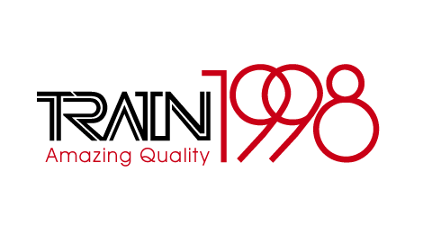
TRAIN 1998 Logo Design