
What is the purpose of a Logo?
April 24th, 2023
What comes to your mind when you think of your fav[...]

Logo redesigning can be an important tool for a company when targeting a new market segment, redefining brand’s identity, introducing a new product, or for various other reasons. If done well, it can help the company greatly in their marketing campaign and in expanding brand’s identity. However, the logo redesigning can also go horribly wrong for the company, failing to deliver their brand message completely and generally run the marketing campaign to the ground. We have gathered five such examples of logo redesigns which turned out to be big failures.
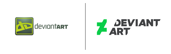
Image Courtesy of: http://blog.fusiontribal.com/
Deviant Art, a community of artists and designers, changed its logo to something unclear and seemingly plagiarized. Their inefficient logo redesign and the fact that “D” of Deviant Art is not visible in the logo wouldn’t have been that big of a failure if it didn’t look plagiarized from Russian company Platzkart. For a community of designers and artists, this is like the worst move ever. Deviant Art users aren’t happy with the change.
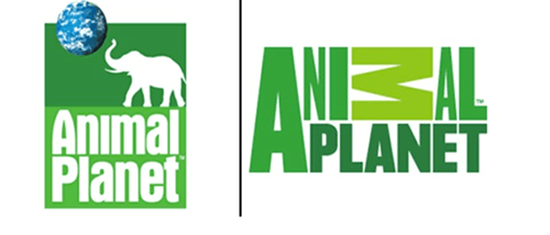
Image Courtesy of: http://www.brandxpress.net/2009/01/animal-planet-logo-change/
Didn’t you just love the original Animal Planet logo? The cute elephant, the actual planet and simple type with the channel’s name, everything was to the point and effective. The logo was true to the motto of the channel of preserving the wild life of the planet. The redesign of the logo lacked a clear direction and was generally confusing. It’s unclear what the different sized letters were trying to portray, not to mention the badly positioned horizontal “M”, the purpose of which is also unclear. All in all, the new logo fails to deliver the intended message, or any message at all.
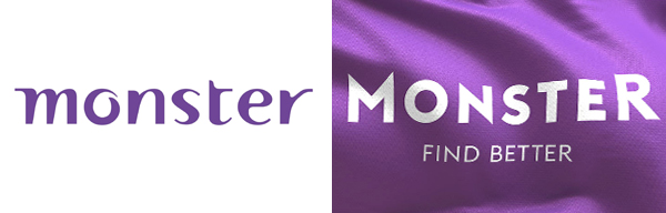
Image Courtesy of: http://www.thebrandingjournal.com/2014/07/new-services-logo-brand-identity-leading-employment-website-monster-com/
When you think of monster, one of the two things come to mind: an actual hideous and scary monster or resumes, jobs, and all that good stuff. What doesn’t come to mind is a questionable and confusing purple waving flag.
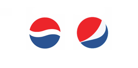
Image Courtesy of: http://doniv.org/blog/2009/03/pepsis-new-logo/
Imagine you spend a million dollars on logo redesigning, creating a big hype about it and, in the end, give your previous logo a little bit of tilt and be done with it. Does it make sense? No? Thought so. Well, that’s exactly what Pepsi did.
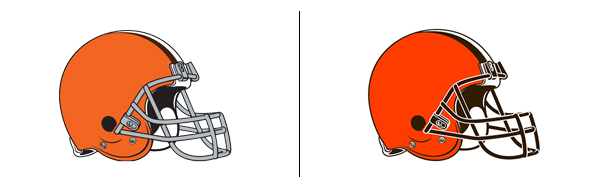
Image Courtesy of: http://www.bladecreativebranding.com/blog/index.php/2015/04/15/cleveland-browns-fumble-2015-rebrand/
Just like Pepsi, Browns changed their logo to pretty much the same one. They went from an orange helmet to a helmet with a little more orange. Yes, it is important to change your brand color sometimes, but they missed a perfect opportunity to change their most boring logo in recent sports history to something more exciting.
April 24th, 2023

October 30th, 2019

October 24th, 2019

October 15th, 2019

October 9th, 2019