
What is the purpose of a Logo?
April 24th, 2023
What comes to your mind when you think of your fav[...]
It’s a bit embarrassing to not be able to differentiate between the types of font. From the serifs to the scripts, to the slabs from the stencils, get an idea of their defining features and how to use them.
Typography is based around the design of characters. It’s a language of its own. With recent software developments, anyone can design their own font, but for that, you need to know the basics.
Serif
A well-designed serif typeface helps the eye in flowing from one character to the other and one syllable to the next. It is able to give printed words a recognizable form. You can use them for text in books and magazines as it will be easier for the reader to go through the words. However, on the digital platform, serif can be hard to make a mark as it depends on the quality. Classic examples are Bodoni, Caslon, Trajan, Eames Century Modern.
Sans-serif
The typeface is generally designed for body copy, captions, and annotations. They perform better on digital rather than print; therefore they are used for websites and apps. They are usually used for posters, signs and digital screens. Classic examples include Helvetica, Gotham, Akzidenz Grotesk, and Futura.
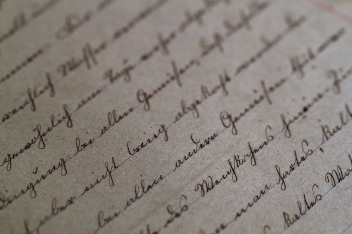
Script
Script mimics cursive handwriting features. They depict the natural flow of writing in an elegant and classic way, with end strokes and swoosh for emphasis on the letters. They are basically used as display typefaces. Designers usually search for a unique look of script. Shelly and Bickham are two of the most classic script fonts. Bellissima is used for a light and airy feel, and Christoper Hand and Black Jack are more of the masculine scrawl type, while Adventure gives a more contemporary vibe.
Monospace
It was initially developed for typewriters and print machines for mechanical use. Its defining feature is that each character occupies the same horizontal space as the other. Courier is used mostly by designers. Monospace was famous when typewriters capable of proportional lettering were developed. However, they are still used for aesthetic and nostalgic reasons. It is proportional and has a different amount of horizontal space for each letter. They are used by designers who opt for a retro look.
Display
It is mostly used for advertising headlines, signs and statement titles. They are large, big and brash in sizes and are sometimes used to evoke an emotional response from the audience. One example is Bella, which is used for its extreme contrast. Karloff, on the other hand, is used for its reversed contrast and is the opposite of elegant. Neu Alphabet depicts classic futurism. They are not designed for body copy due to their bold feature.
April 24th, 2023

October 30th, 2019

October 24th, 2019

October 15th, 2019

October 9th, 2019