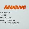
What is the purpose of a Logo?
April 24th, 2023
What comes to your mind when you think of your fav[...]
Your logo is your identity; it is the backbone of your company and should always be powerful. Many companies use different approaches in their design. They use different fonts, play with texture or go with simplicity. Brands become legendary when they take risks.
Some brands have taken a step forward and removed their names from their logos. It takes a lot of confidence, because only if you’re world famous, can you decide to do that. The most amazing thing your textless logo achieves is that your brand gets personalized and loses the commercial touch.
If your symbol is globally recognized, only then can you opt for a textless logo as it represents your uniqueness. Some big companies have stripped out their company name from their logo. Here’s why they work.
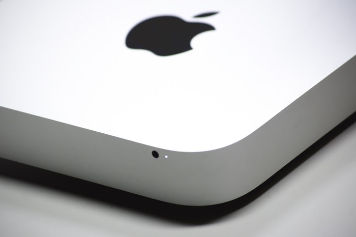
Apple
Apple had turned its logo textless as early as in 1984. For decades it has been creating a loyal base of customers who can recognize the ‘apple’ anywhere. If you look at Apple’s old logo, it was a woody illustration of Isaac Newton sitting under a tree reading a book, and there was Apple Computer Co. written on it.
Starbucks
Who could have ever thought that a mermaid can be associated with coffee? But coffee aficionados all around the world know Starbucks from its green and white mermaid logo. The company was originally named after Captain Ahab’s first mate in Moby Dick. The designer drew his version of a 16th-century two-tailed mermaid. However, the name from their logo was dropped later, and it really hasn’t made much difference in its popularity.
McDonald’s
The golden arches were part of the architecture of the restaurants. They made their way into the logo in 1961. Before that, McDonald’s had an elaborate text logo with its famous taglines such as McDonald’s famous barbecue’ (1940) and ‘McDonald’s famous hamburgers… buy ’em by the bag’ (1948).
By 1968, the golden arches had paved their way into the logo with the red background added in 1975. However, the tagline ‘I’m lovin’ it’ replaced the company’s name in the logo across many platforms. With the fast-food chain being known in every part of the world, and on every street, the golden arches were enough to be identified as our favorite place to eat.
Target
The great thing about Apple and Target was that it had the good fortune of visual shorthand in its company name. Target had been using its ring logo across many platforms without the name. When the stores became even famous, the six-ringed logo was turned to three-ringed. Every kid in America knows what the symbol means as they can shop their heart out in Target.
April 24th, 2023

October 30th, 2019

October 24th, 2019

October 15th, 2019

October 9th, 2019