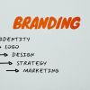
What is the purpose of a Logo?
April 24th, 2023
What comes to your mind when you think of your fav[...]
Website designs have become similar and boring. Whether it is user patterns or shortage of ideas, every site you stumble upon looks pretty much basic. However, there’s still hope. While some people adjust with the same old’ designs, others are happy to try new ideas. If you’re one of those designers, who are looking for something different, here are some of the unique and innovative ideas for website design to break the routine. It will also unleash your creative side and help you skip the boring patterns.
Vertically divided homepage
One page websites are common with a large image or video to draw people’s attention. They are divided horizontally. However, you can experiment with a vertical design with multiple stories to tell. To make the interface interesting, the use of hover actions is made to unveil information on each panel. When the still images open, a video or animation will play. The design is very compelling as it will make people get excited about what is hidden behind the panels. It can also break up complex information and makes the process simple and fun for users.
Card deck on game board
Card-style design pattern became popular a few years back but was not used by people for a while have made a comeback. A massive display of cards on a game board style canvas is a unique and eye-catching design. It does not require videos, sounds or navigation, but just a lot of cards with headlines. However, the idea is not to make it complicated for users, but to display everything in a synchronized manner. There is a zoom and center toggle which will keep users on their toes on what lies in store for them.
Background filled with tiles
If you’re thinking of going a little bold and want to excite and leave your users a little taken aback, try placing tiles in the background. Tiles are tiny thumbnails of a design. Think of a block print design with same symbols all over. Pin-up Magazine uses it on its website and it does look quite impressive. It is ideal for something like a magazine cover which is daunting on their own and needs a little spice. The users will be forced to scroll down due to the lack of elements present on the homepage. They would want to explore more and also maybe to give their eyes a rest from the homepage design which can get a little brutal.
Give your users a chance to have fun with your website and you will notice that your engagement patterns will improve very soon as users love when they see a website which has a great design.
April 24th, 2023

October 30th, 2019
October 24th, 2019

October 15th, 2019

October 9th, 2019