
What is the purpose of a Logo?
April 24th, 2023
What comes to your mind when you think of your fav[...]
In business, one of the most important things is connections and networking. The more connections you have in the industry, the easier it is to market your product, find new clients and grow your business. Networking is necessary to increase the awareness of your business among stakeholders.
To grow your connections, it is important to give your stakeholders some means to get connected with you. Today, it can be a Linkedin or Twitter profile, but there something else that has been around for a long time, i.e. a business card.
People still use business cards to connect with others when they need, because the fastest way to connect with someone is either to call them or visit their office or home. This is why your business card must have a design that leaves quite an impression to your connections. Here are some tips to help you design such a business card.
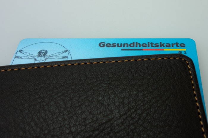
Before you even start thinking about what to put on your business card, it is important to fast determine its specifics, i.e. color, size, and orientation. The typical size of a business card is 3.5 x 2.5 inches. If you go for a bigger size then it will cost you more money and the card might not fit in a cardholder or wallet, hence making it unlikely to be kept.
When it comes to color, it is very simple. Use the one that represents your brand color theme. For example, if your brand identity or logo has blue and white color in it, then design your business card around those colors. It is best to use 1 or 2 colors because not only will it save you money, the text on the card will be easier to read as well.
For orientation, you can go with whatever suits you best, i.e. landscape or portrait. The Landscape is a common and traditional style. It is easier to read it from a cardholder as well. Whereas, the portrait is a unique design that has become a trend recently, but it is not easy read it from a cardholder.
Text on business card is the most important element here, after all the purpose of a business card is to let others know how to contact you. The text on a business card should be easier to read. So, choose the typeface and font size wisely. Avoid using decorative font because it is difficult to read unless it is part of your brand identity, in that case, only use it for your company name. The font size of the text should be at least 8 point
April 24th, 2023

October 30th, 2019

October 24th, 2019

October 15th, 2019

October 9th, 2019